


There are many tools to help you with project at work, school or home. The Google Docs suite is one of them them. This Cloud software helps you to create word documents, spreadsheet or presentation using the individual apps such as Docs, Sheets or Slides.
Because Google is big on integration, these apps can work with each other to help you create documents seamlessly. For instance, you can create a graph in Google Docs via Google Sheets. In the guide, we cover how to create a graph in Google Docs.
How to Create a Chart in Google Docs
There’s a way to add graphs and charts to your Google Docs. You’ll need to make use of Google Sheets to do this process. Here’s how to combine Google Sheets with Google Docs to add graphs and charts.
1. Open the Google Docs document where you want a graph added to.
2. Next, input the data you need into the cells.
3. After that, select the cells that have the data. Next, click Insert > Chart.

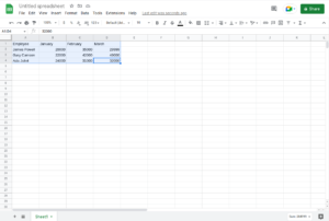

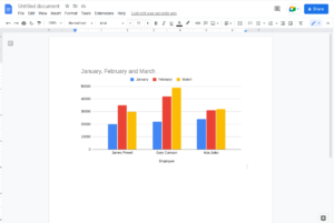
4. After that, the chart will be automatically appear in the sheet.

How to Insert the Chart into Google Docs
You can use your keyboard controls to copy your chart.
You can either use CMD + C on macOS or CTRL + C on Windows.
Go to the Google Docs file and right-click the area you want to place the graph. You can use your keyboard shortcut to paste the graph. You can press CMD + V on Mac and CTRL + V on Windows.
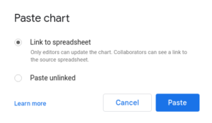
You’ll then see a Paste Chart Menu with different options: Link to Spreadsheet and Paste Unlinked. You can choose the one that best suits you.

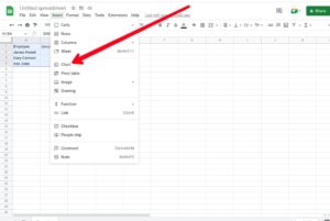
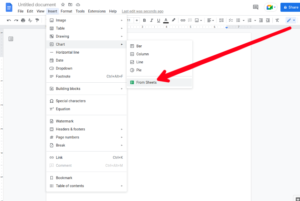
Another way to insert it is by going back to Google Docs and clicking Insert > Chart. At the bottom of the menu, you’ll see the “From Sheets” option. Select it and you will see your most recent sheets.

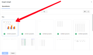
You can also reopen the spreadsheet if you like or even modify the data for the spreadsheet.
How to Modify the Chart Type
It’s possible to modify the chart type for the graph you added to Google Docs. To do that, you have to open the graph in Google Sheets.
1. First, open the Google Docs file that contains the graph.
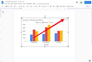
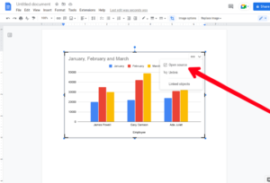
2. Next, click on the graph to make it highlighted. You’ll see the link icon to the sheet.
3. Click the link icon, and then click “Open Source” which will open the Google Sheets file.

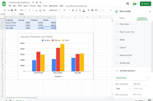
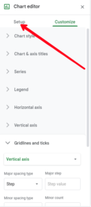
4. When it opens, click the graph and then double-click the chart. You can also click the three vertical lines at the right-hand corner of the chart. This will open the editor.
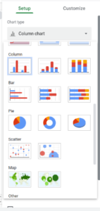
5. Next, click the Setup tab. After doing that, click Chart Type drop-down menu.

6. Next, choose the chart type that’s best for your data.

7. Next, click “Update” in Google Docs.
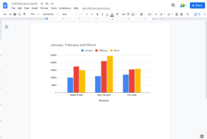
This will update the chart with the edit.
Rounding Up…
Maybe you need to give a graphical representation of a report on your Google Docs document, using Google Sheets gives you the opportunity to do this. You can work across the two apps and create graphs and charts for your word document. We hope you found this helpful. Kindly leave a comment and don’t forget to share…